Get In Touch
Hello@rbvs.nl

Pictet x Backbase

In 2022, Pictet Wealth Management, a historic Swiss asset manager, partnered with Backbase to enhance their digital platform. This case study highlights the efforts to improve user engagement and experience through a user-centric design strategy, creating a seamless and intuitive platform for their unique clientele.

  • Tools

    Figma, Miro

  • Role

    Senior UX Designer

  • Project phase

    Production

Intro

Digital Transformation for Enhanced User Engagement

Pictet is a Swiss asset manager with over 200 years of experience, founded in 1805. They serve individuals, families, financial institutions, and institutional investors. Pictet distinguishes itself by offering undivided attention and expertise without external shareholder pressures.

As an independent firm, their goal is to direct capital to the real economy, improving the planet through responsible partnerships. Pictet’s long-term investment strategy and commitment to sustainability make them a trusted partner globally.

Challenge

Increase user engagement and adoption of Pictet's digital products among a wider range of clients.

To achieve this goal, Pictet is committed to designing a user experience that is intuitive, user-friendly, and accessible. This means taking into account the diverse digital literacy and experience of its clients, and ensuring that the platform is easy to navigate and understand for everyone.

In addition to creating a user-friendly platform, Pictet recognises the importance of the personal touch which is be created by having close contact with the relationship manager.

By prioritising user experience and support, Pictet is confident that it can increase engagement and adoption of its digital products among clients of all backgrounds and levels of digital literacy. This will ultimately help to drive growth and success for the company in the digital age.

Design Process

Design Process and UX Strategy

During the design process for Pictet, we started out with a week long “inception”. During this week we had daily workshops where we discussed the current Backbase offering and which features needed to be extended to match the Pictet core systems.

After the inception, I created the UX strategy for Pictet where research, design system styling and design principles where combined to match the the Pictet vision. Besides I created a document with extensive documentation about our design system and how we can implement this for Pictet.

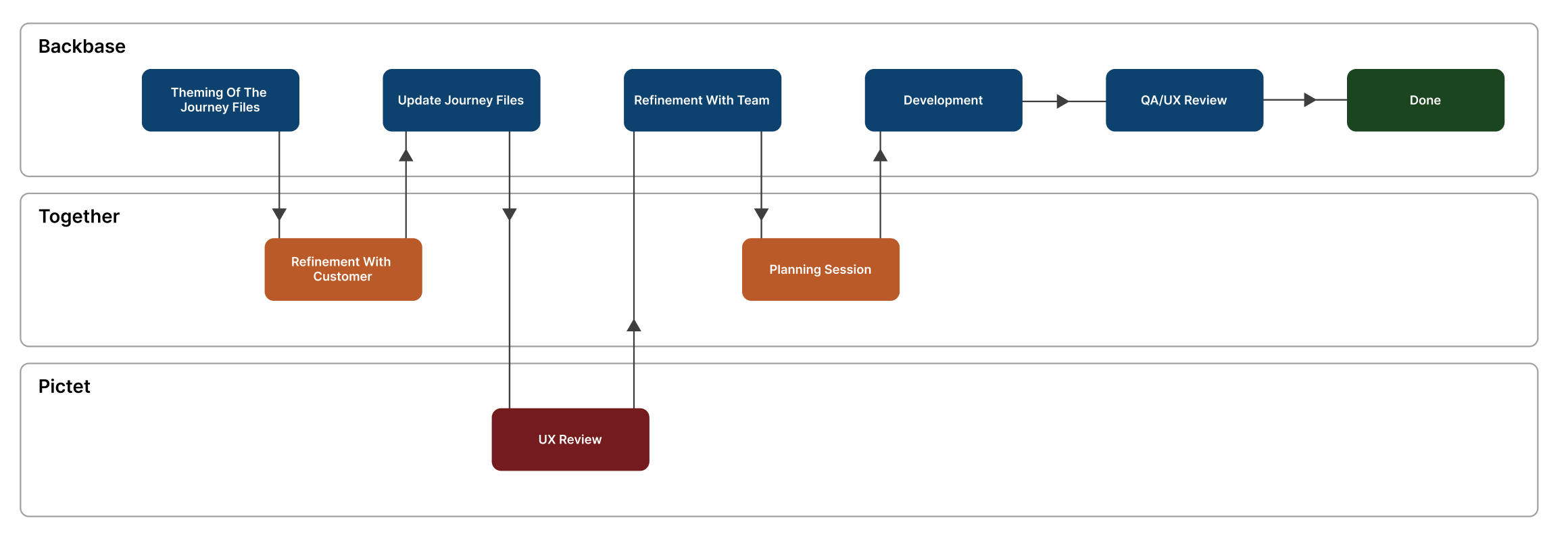
In the weeks after, we went into our regular two week delivery cycle which looks as followed:

Getting started

Workshops & Sticky Notes

Prior to the inception week we shared a calendar with all our scheduled workshops. This allowed Pictet to have the right people in the room for each workshop.

We started off by explaining the way we will be working together during the week and set up some ground rules together. We also added some post-its to the walls where we can put parking lot items.

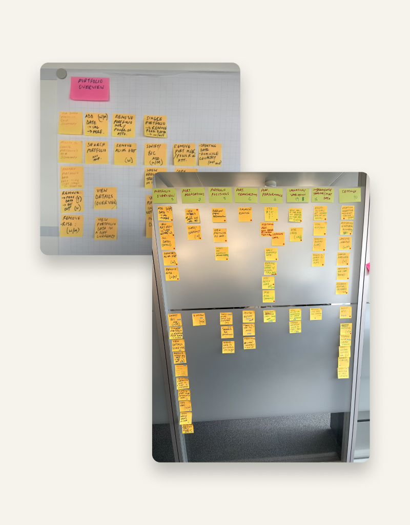
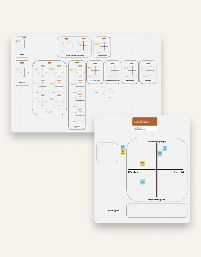
During each workshop we covered a specific topic, for example “Payments”, “Portfolio’s” or “Account Statements”. In these workshops we showcased our out of the box product and asked if there were things missing. In case there was, we identified a gap, wrote it on a post-it and add it to the wall. Besides that I also created a Miro board, which allowed me to add the post-it directly on the designs.

Getting started

Documentation of the journeys

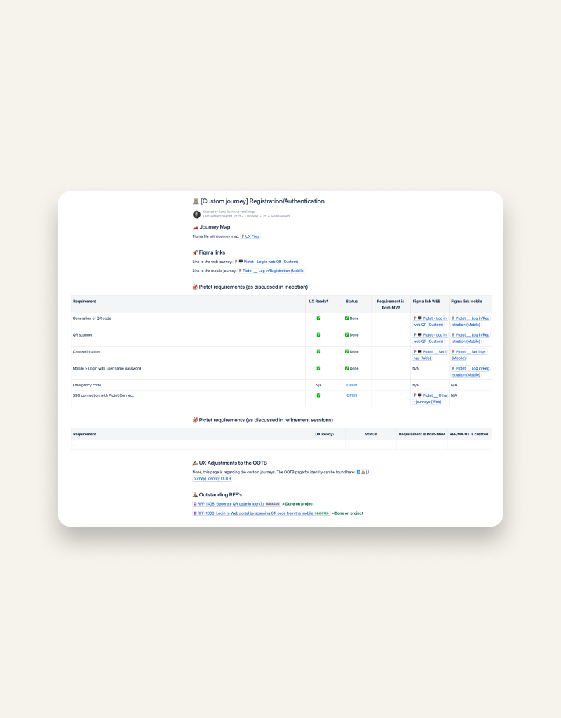
In order for everyone to have access to the latest information about the project, I organised everything in Confluence. Based on each epic I added a page with the journey map, links to the Figma designs, the original requirements and requirements that came in after our refinement sessions. Besides that, I added the outstanding RFF’s to the page, so we were able to track the progress.

Getting started

Organising insights

At the end of the week had a session to set the priorities with Pictet. We started with setting priorities to the journeys and afterwards the gaps that we identified. To prioritise the gaps we used dot voting. We gave them three kinds of coloured stickers and added them to the post-its on the wall.

Since we experienced a lot of dependencies during this project, I created multiple matrixes in our Miro board to start working as efficient as possible. To better identify on which journeys to start working, I created a matrix for each journey. It could also be the case that there are RFF’s created for RnD, in that case we didn’t add them to the matrix.

Approach

UX Strategy

In the weeks after the Inception I fine tuned the UX strategy and I did some desk and qualitative research into the users of Pictet.

Methods & techniques used

  • Interviews with internal users
  • Interviews with relationship managers
  • Data analysis
  • Audit of existing UX
  • Journey mapping
  • Persona’s

Design phase

During the design phase I created wireframes for the custom features and translated them in to clickable prototypes that ensure a seamless user experience across all channels.

In order to understand the information architecture for the custom solutions that we needed to build, I created user flows to understand all potential routes a user and encounter.

Development & Testing

During the testing/QA phase we had weekly UX review sessions to keep track of the progress and make sure that the product closely matches the design. As part of the initial launch we started with a friends and family release. This will give internal users in the bank the opportunity to share feedback and point out any bugs that might slipped through.

Statistics

Project by the numbers.

0

Journeys Delivered

Each journey was crafted to meet the standards of Pictet’s clientele.

0

Design Iterations

Multiple iterations to perfect the user experience.

0

Workshops Given

Collaborative sessions to align on goals and refine design strategies.

Delivery

Delivered Products

01.

Portfolio's Journey

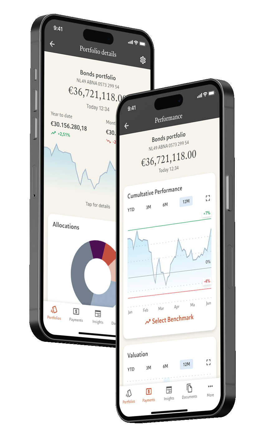
The portfolio journey was one of the most important journeys that was included in the scope of the project. The final product features a user-friendly experience that allows clients to see a clear overview of their portfolio and its performance.

03.

Log In Journey

For Pictet, the biggest custom journey that was integrated was the log in with QR code scanner, which was a specific Swiss requirement. The requirement of the log in was that the web device and mobile device are in the same room, so we created a QR code scanner to fulfil this requirement.

02.

Payments Journey

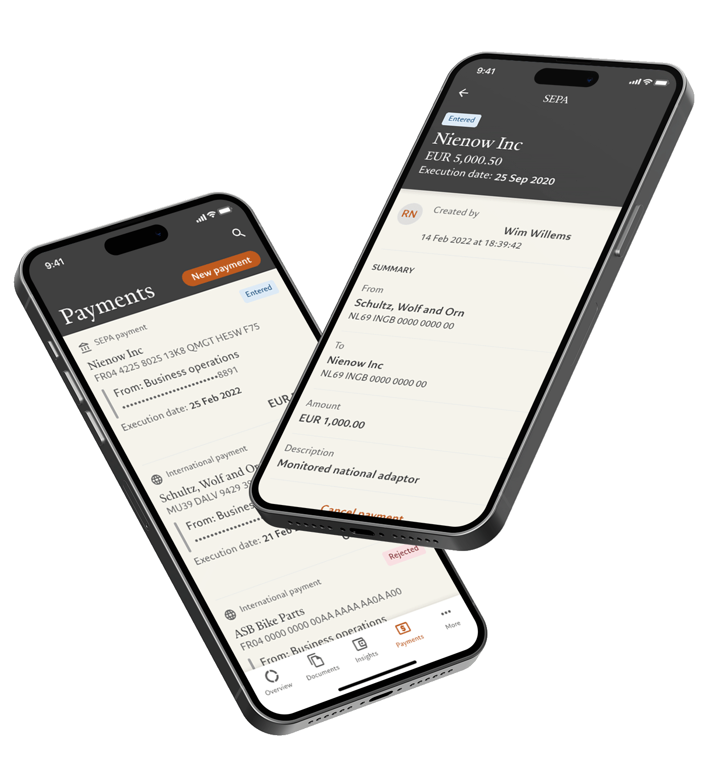
Next to the portfolio journey, we’ve also implemented a payment wizard that allows the user to make a payment without deciding upfront if they need to make an international or SEPA payment. This wizard guides the user through the process and helps them to select the correct payment type based on the information they provide.

04.

Omnichannel experience

We aimed to create a consistent user journey across all channels, which resulted in a seamless experience for the users. This means that the platform is accessible and easy to navigate regardless of which channel the user chooses to access it from.

Learnings

Design Challenges

One of the biggest challenges during this project was the lack of research about the users and possibility to organise interviews with actual users. Since the core users of the Pictet app are VIP’s all information was gathered by the relationship managers of the clients.
Contact

Let’s Discuss Your Next Project!

Interested in elevating your digital experience? Book a 15-minute call and learn how my UX/UI design expertise can bring your vision to life. I’m here to help you create compelling, user-centric solutions that drive success.

Back

This website stores cookies on your computer. Cookie Policy