Gall & Gall is a well-established Dutch retailer specializing in wines, spirits, and beers. With a rich history dating back to 1884, Gall & Gall has grown into one of the largest and most respected chains in the Netherlands, boasting a network of over 600 stores. Known for their extensive product range and expert advice, Gall & Gall aims to provide customers with an exceptional shopping experience, whether they are experts or casual consumers. Their commitment to quality, convenience, and customer service has solidified their reputation as a trusted name in the industry.
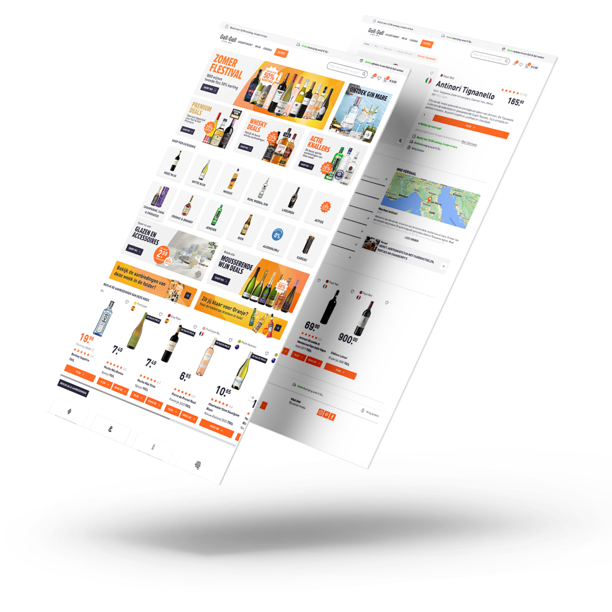
Creating a design system for Gall & Gall to elevate their UX maturity and streamline the design process. The challenge was to develop a robust and flexible design system that ensured consistency across all digital touchpoints, allowing designers to focus on enhancing the customer journey. By eliminating the need to recreate existing designs repeatedly, the design system enabled designers to devote more time to improving the user experience.
We began by evaluating the current webpage, identifying UI elements, and cataloging design patterns and inconsistencies. User feedback and analytics were also gathered to pinpoint areas for improvement.
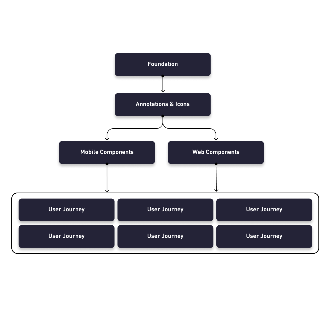
Establishing a clear vision, we set objectives to achieve consistency, scalability, and efficiency. The main goal of the design system was to improve the efficiency of UX designers and enhance UX maturity within the organization. We also defined the structure of the design system, ensuring it was organized and easy to use. Guiding principles such as accessibility, responsiveness, and usability were defined to align with brand and user needs.
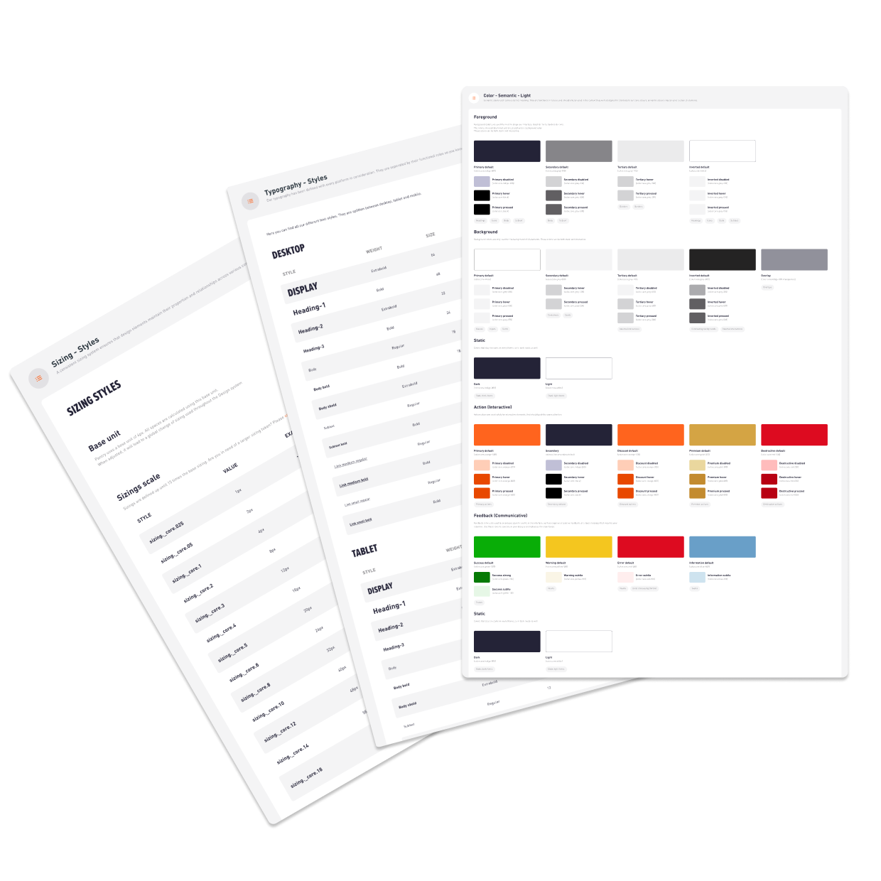
We developed a design foundation that served both the website and the mobile app. This comprehensive foundation included typography, color palette, spacing and layout system ect. to ensure visual harmony and consistency. Additionally, the Etos app was integrated to work on the same foundation, providing a seamless and cohesive user experience across multiple banners.
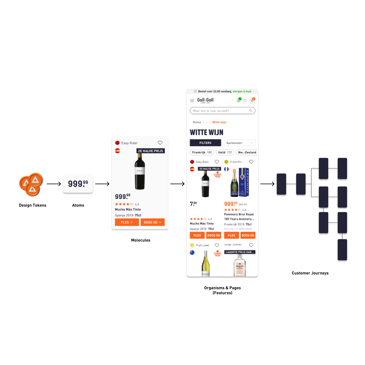
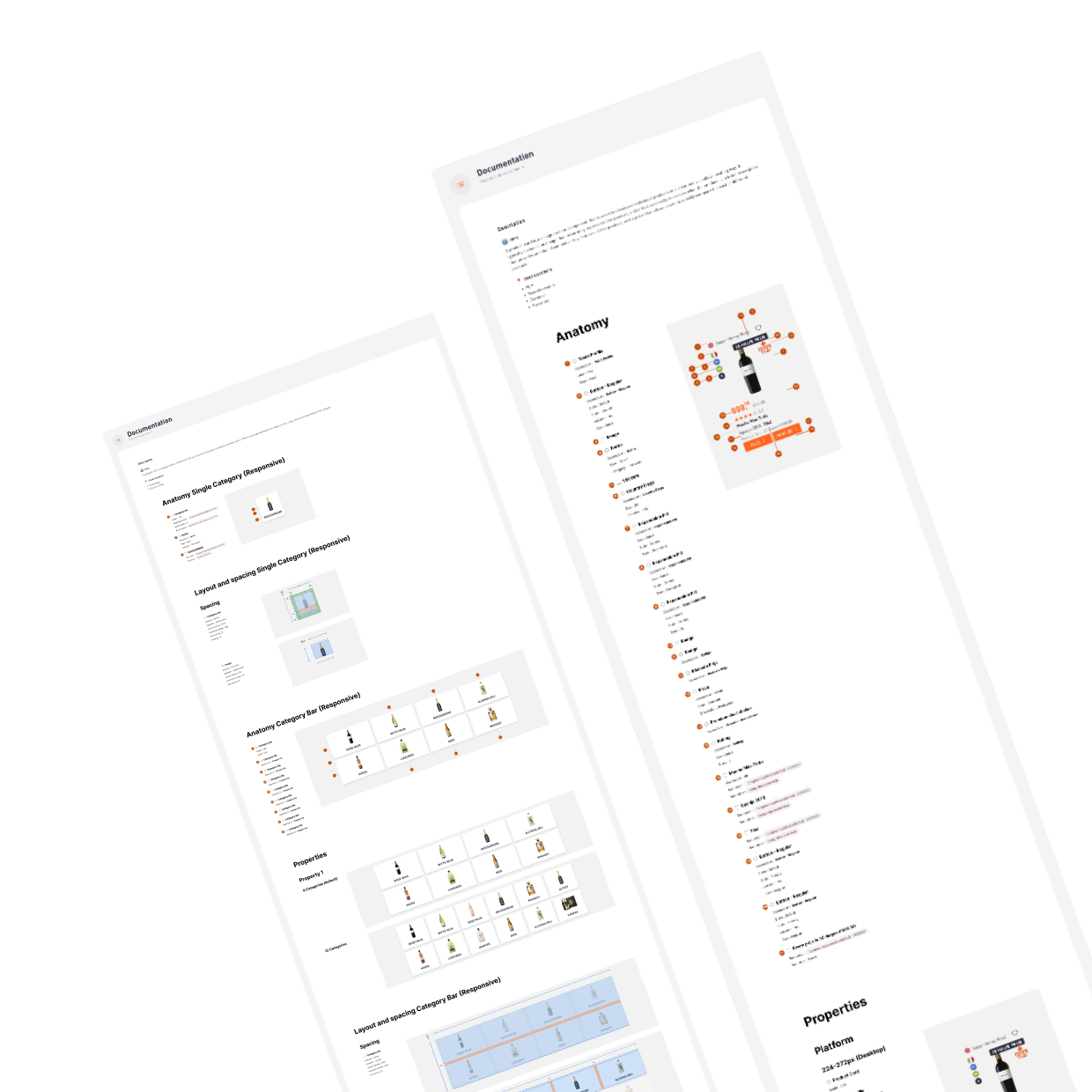
Utilizing an atomic design approach, we created a library of reusable components, ranging from simple elements to more complex structures. Examples of simple components include filter chips and buttons, while more complex components include product cards and product listing pages. Each component was carefully documented including usage guidelines and variations.
A detailed guide for each was created, covering all design elements and providing clear usage guidelines. This documentation also included the locations where each component is used, ensuring consistency and clarity for design and development teams.
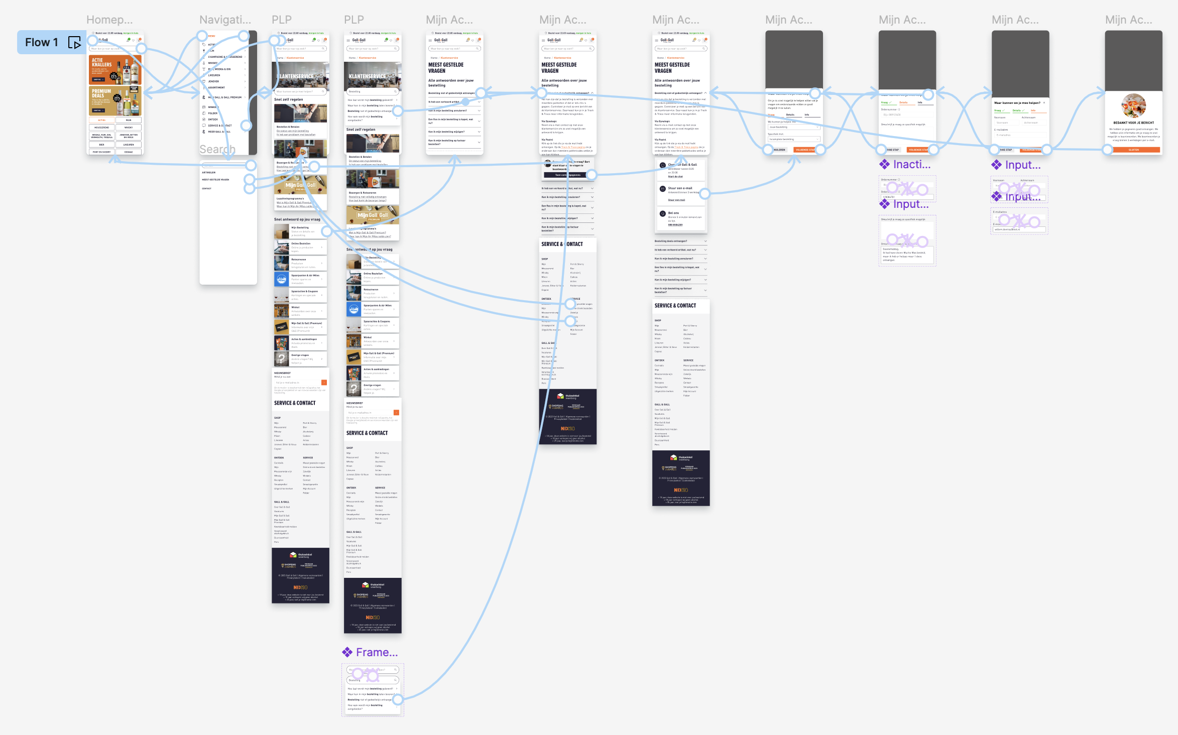
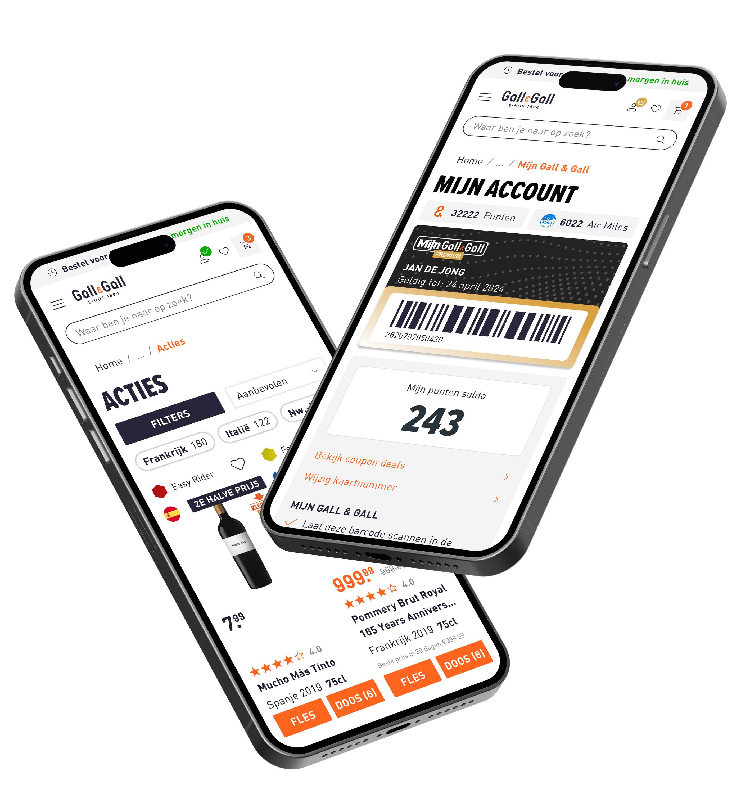
Full features and customer journeys were mapped out using the created components. This ensured that all user interactions were consistent and intuitive, providing a seamless user experience across different devices.
We implemented the design system components incrementally. Whenever a specific feature was added or adjusted, the new components were implemented simultaneously to maximize efficiency.
Given that multiple designers were using the design system, we established a feedback loop to keep the design system up to date. For instance, during A/B testing, we created multiple components, and the winners of these tests were added or updated in the design system. This process ensured continuous improvement and relevance of the design system.
Scalability of Design Systems: Creating a flexible and scalable design system was essential for accommodating future updates and expansions. This approach not only saved time but also made it easier to introduce new features without compromising on design quality.
Collaboration is Key: Successful implementation of the design system required close collaboration between designers, developers, and other stakeholders. Regular communication and feedback loops were vital in ensuring everyone was aligned and the design system was effectively integrated.
Balancing Flexibility and Consistency: Striking the right balance between flexibility and consistency was challenging. While it was important to allow for customization and unique branding elements, maintaining a consistent look and feel across all platforms was paramount.
Managing Stakeholder Expectations: Aligning the vision and expectations of various stakeholders was a complex process. It required clear communication and sometimes, compromise, to ensure that the design system met the needs of all parties involved.
Interested in elevating your digital experience? Book a 15-minute call and learn how my UX/UI design expertise can bring your vision to life. I’m here to help you create compelling, user-centric solutions that drive success.
